Let's create an Animated Social Media Card Hover using HTML, CSS, and JavaScript. This project features sleek, interactive social media cards that animate beautifully when hovered, making your profile or link section more engaging and professional. 💻✨
Perfect for portfolios, personal websites, or any project where you want to showcase social media links with style!
🎯 What You'll Build
Interactive social cards with:
- Cursor-following radial gradient effects
- Smooth hover animations with glow effects
- Platform-specific colors (Instagram, GitHub, LinkedIn)
- Dynamic JavaScript tracking mouse position
- Glassmorphism design with dark theme
📁 File Structure
project-folder/
├── index.html
├── style.css
└── script.js
🏗️ HTML Code
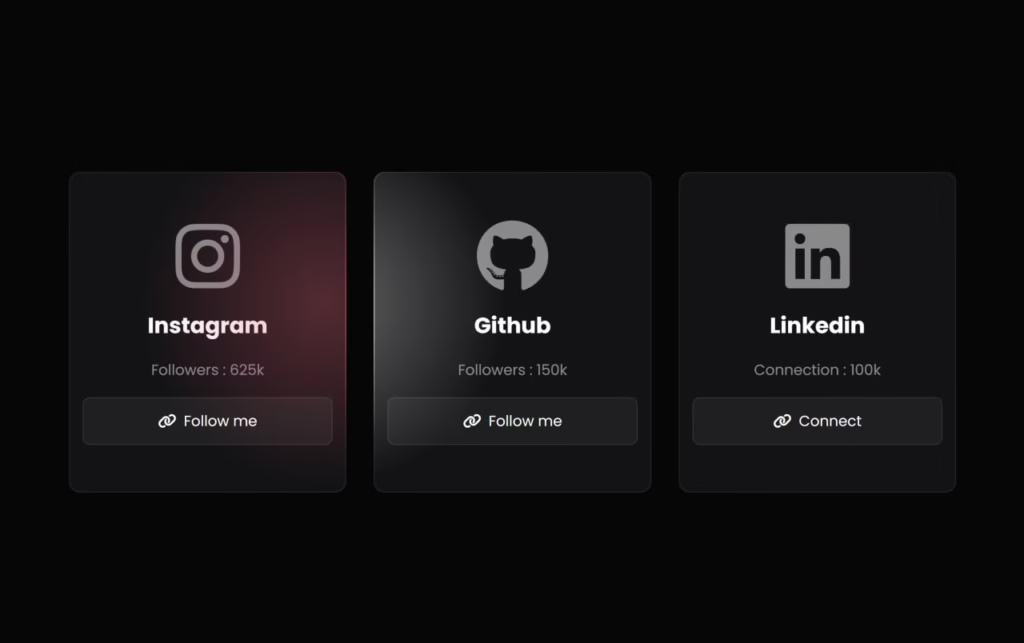
This HTML creates three social media cards (Instagram, GitHub, LinkedIn) using Font Awesome icons. Each card displays the platform name, follower count, and a "Follow me" link.
<!DOCTYPE html>
<html lang="en">
<head>
    <meta charset="UTF-8">
    <meta name="viewport" content="width=device-width, initial-scale=1.0">
    <title>Social Media Card Hover | @Flemuxbros</title>
    <link rel="stylesheet" href="https://cdnjs.cloudflare.com/ajax/libs/font-awesome/6.7.2/css/all.min.css" integrity="sha512-Evv84Mr4kqVGRNSgIGL/F/aIDqQb7xQ2vcrdIwxfjThSH8CSR7PBEakCr51Ck+w+/U6swU2Im1vVX0SVk9ABhg==" crossorigin="anonymous" referrerpolicy="no-referrer" />
    <link rel="stylesheet" href="style.css">
</head>
<body>
    <div id="cards">
        <div class="card">
            <div class="card_content">
                <i class="fa-brands fa-instagram"></i>
                <h2>Instagram</h2>
                <p>Followers : <span>625k</span></p>
                <a href="#">
                    <i class="fa-solid fa-link"></i>
                    <span>Follow me</span>
                </a>
            </div>
        </div>
        <div class="card">
            <div class="card_content">
                <i class="fa-brands fa-github"></i>
                <h2>Github</h2>
                <p>Followers : <span>150k</span></p>
                <a href="#">
                    <i class="fa-solid fa-link"></i>
                    <span>Follow me</span>
                </a>
            </div>
        </div>
        <div class="card">
            <div class="card_content">
                <i class="fa-brands fa-linkedin"></i>
                <h2>Linkedin</h2>
                <p>Connection : <span>100k</span></p>
                <a href="#">
                    <i class="fa-solid fa-link"></i>
                    <span>Connect</span>
                </a>
            </div>
        </div>
    </div>
    <script src="script.js"></script>
</body>
</html>
🎨 CSS Code
This CSS creates the glassmorphism effect with radial gradients that follow the cursor. Each card has its own color theme (Instagram pink, GitHub white, LinkedIn blue) and uses CSS custom properties for dynamic mouse tracking.
@import url("https://fonts.googleapis.com/css2?family=Poppins:wght@300;400;500;600;700&display=swap");

/* Reset and base styles */
*, *::after, *::before {
  box-sizing: border-box;
  margin: 0;
  padding: 0;
}

body {
  font-family: 'Poppins', sans-serif;
  min-height: 100vh;
  background: #060606;
  display: grid;
  place-items: center;
  color: #fff;
}

/* Cards container */
#cards {
  width: 70%;
  padding-inline: 20px;
  display: flex;
  flex-wrap: wrap;
  gap: 30px;
}

/* Card base styles */
.card {
  min-width: 200px;
  height: 350px;
  flex: 1 1 250px;
  background: rgba(255, 255, 255, 0.12);
  border-radius: 12px;
  position: relative;
}

/* Card hover background gradient */
#cards:hover > .card {
  background: radial-gradient(
    400px circle at var(--mouse-x) var(--mouse-y),
    hsl(var(--color) / 1),
    rgba(255, 255, 255, 0.12) 40%
  );
}

/* Card content container */
.card_content {
  position: absolute;
  inset: 1px;
  background: #131315;
  border-radius: inherit;
  display: flex;
  flex-direction: column;
  justify-content: center;
  align-items: center;
  gap: 18px;
}

/* Platform-specific colors */
.card:nth-child(1) {
  --color: 348 80% 60%; /* Instagram pink */
}

.card:nth-child(2) {
  --color: 0 0% 100%; /* GitHub white */
}

.card:nth-child(3) {
  --color: 220 100% 35%; /* LinkedIn blue */
}

/* Card glow effect */
.card::before {
  content: "";
  position: absolute;
  width: 100%;
  height: 100%;
  top: 0;
  left: 0;
  background: radial-gradient(
    500px circle at var(--mouse-x) var(--mouse-y),
    hsl(var(--color) / 0.35),
    transparent 40%
  );
  border-radius: inherit;
  opacity: 0;
  z-index: 2;
}

#cards:hover > .card::before {
  opacity: 1;
}

/* Icon styles */
.card_content > i {
  font-size: 5rem;
  color: rgba(255, 255, 255, 0.5);
}

/* Text styles */
.card_content > p {
  color: rgba(255, 255, 255, 0.5);
}

/* Button styles */
.card_content > a {
  all: unset;
  cursor: pointer;
  width: 90%;
  padding-block: 0.8rem;
  background: rgba(255, 255, 255, 0.05);
  border: 1px solid rgba(255, 255, 255, 0.1);
  border-radius: 8px;
  display: flex;
  justify-content: center;
  align-items: center;
  gap: 8px;
  z-index: 10;
  transition: all 0.3s ease;
}

.card_content > a:hover {
  background: rgba(255, 255, 255, 0.1);
  border: 1px solid rgba(255, 255, 255, 0.2);
}
⚡ JavaScript Code
This JavaScript tracks mouse movement and updates CSS custom properties (--mouse-x and --mouse-y) for each card, creating the cursor-following gradient effect.
const cards = Array.from(document.querySelectorAll('.card'));
const cardsContainer = document.querySelector('#cards');

cardsContainer.addEventListener('mousemove', (e) => {
  for (const card of cards) {
    const rect = card.getBoundingClientRect();
    const x = e.clientX - rect.left;
    const y = e.clientY - rect.top;
    card.style.setProperty('--mouse-x', `${x}px`);
    card.style.setProperty('--mouse-y', `${y}px`);
  }
});Need the complete project files? Download the ready-to-use source code!
📥 Download Source Code
✨ How It Works
The Animation Breakdown
Radial Gradient Effect:
- CSS uses
var(--mouse-x)andvar(--mouse-y)as the center point - JavaScript updates these values on every
mousemoveevent radial-gradient()creates circular glow from cursor position
Color Scheme:
| Platform | HSL Color | RGB Equivalent |
|---|---|---|
348 80% 60% | Pink/Red | |
| GitHub | 0 0% 100% | White |
220 100% 35% | Blue |
Glassmorphism:
- Background:
rgba(255,255,255,0.12)(semi-transparent white) - Inner content: Dark background
#131315 - Border radius:
12pxfor smooth edges
🎨 Customization Options
Add More Social Platforms
<div class="card">
    <div class="card_content">
        <i class="fa-brands fa-twitter"></i>
        <h2>Twitter</h2>
        <p>Followers : <span>500k</span></p>
        <a href="#">
            <i class="fa-solid fa-link"></i>
            <span>Follow me</span>
        </a>
    </div>
</div>.card:nth-child(4){ --color: 203 89% 53% } /* Twitter blue */Change Gradient Size
#cards:hover > .card {
  background: radial-gradient(600px circle at var(--mouse-x) var(--mouse-y),
    hsl(var(--color)/1), rgba(255,255,255,0.12) 40%)
}
Adjust Glow Intensity
.card::before {
  background: radial-gradient(500px circle at var(--mouse-x) var(--mouse-y),
    hsl(var(--color)/0.5), transparent 40%); /* Increase from 0.35 to 0.5 */
}
🐛 Troubleshooting
Gradient not following cursor? Make sure JavaScript is loaded and mousemove event is firing.
Icons not showing? Verify Font Awesome CDN link is correct and loaded.
Cards not responsive? Check that flex-wrap: wrap is applied to #cards.
🎉 Conclusion
Building an Animated Social Media Card Hover with HTML, CSS, and JavaScript teaches you:
- CSS Custom Properties for dynamic styling
- Radial gradients with variable positioning
- Mouse tracking with JavaScript
- Glassmorphism design patterns
This effect works great for portfolios, bio pages, or any site where you want to make social links stand out! 🚀
Happy Coding! ✨
Need help? 📧 flemuxstudio@gmail.com | 📞 +91 62899 98072
Written by: Anirban Das | Flemux Studio 🚀