Let's create a Netflix Button Animation using HTML, CSS, and JavaScript. This project replicates the bold, cinematic feel of Netflix with an animated button that responds dynamically to hover and click events. 🍿🔥
Perfect for learning how to combine front-end technologies to build interactive and visually striking UI components!
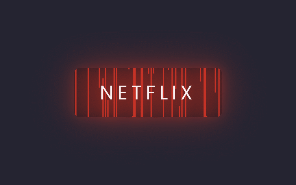
🎯 What You'll Build
An animated button with:
- Red Netflix theme with glowing effects
- Animated vertical lines that expand on hover
- Smooth transitions and letter spacing changes
- Dynamic JavaScript animation with random delays
📁 File Structure
project-folder/
├── index.html
├── style.css
└── script.js
🏗️ HTML Code
This code creates a simple webpage with a button styled as "Netflix." The HTML defines a container holding a link with the class btn, which will be styled to look and animate like a Netflix button.
<!DOCTYPE html>
<html lang="en">
<head>
    <meta charset="UTF-8">
    <meta name="viewport" content="width=device-width, initial-scale=1.0">
    <title>Netflix Button Animation</title>
    <link rel="stylesheet" href="./style.css">
</head>
<body>
 <div class="container">
   <a href="#" class="btn">Netflix</a>
 </div>
 <script src="script.js"></script>
</body>
</html>
🎨 CSS Code
This CSS styles the Netflix button with a modern animated effect. It centers the button on a dark background, gives it Netflix's signature red color, and makes it glow with a red shadow when hovered.
@import url("https://fonts.googleapis.com/css2?family=Poppins:wght@100;200;300;400;500;600;700;800;900&display=swap");

* {
  margin: 0px;
  padding: 0px;
  box-sizing: border-box;
}

body {
  font-family: "Poppins", serif;
  display: flex;
  justify-content: center;
  align-items: center;
  height: 100vh;
  background: #252432;
  overflow: hidden;
}

.btn {
  position: relative;
  width: 240px;
  height: 80px;
  display: flex;
  justify-content: center;
  align-items: center;
  background: rgba(0, 0, 0, 0.2);
  border-radius: 10px;
  cursor: pointer;
  overflow: hidden;
  font-size: 2em;
  transition: 0.5s;
  text-decoration: none;
  text-transform: uppercase;
  letter-spacing: 0.05em;
  color: #e50914;
}

.btn:hover {
  filter: drop-shadow(0 0 10px #e50914) drop-shadow(0 0 30px #e50914);
  letter-spacing: 0.2em;
  color: #fff;
}

.btn span {
  position: absolute;
  top: 0;
  width: 2px;
  height: 100%;
  background: #e50914;
  pointer-events: none;
  transition: transform 0.2s ease-in-out;
  z-index: -1;
  transform: scaleY(0);
  transform-origin: bottom;
}

.btn:hover span {
  transform: scaleY(1);
  transform-origin: top;
}

.btn span:nth-child(even) {
  transform-origin: top;
}

.btn:hover span:nth-child(even) {
  transform-origin: bottom;
}
⚡ JavaScript Code
This JavaScript creates the animated effect by dynamically adding 120 <span> lines inside the button. Each span is positioned slightly to the right and given a random transition delay, creating a glowing, wavy Netflix-style animation effect.
document.addEventListener("DOMContentLoaded", function () {
  let btns = document.querySelectorAll(".btn");

  btns.forEach(function (btn) {
    let spans = [];

    for (let i = 0; i < 120; i++) {
      let span = document.createElement("span");
      span.style.left = `${i * 2}px`;
      spans.push(span);
      btn.appendChild(span);

      let randomDelay = Math.random() * 1 + 0;
      span.style.transitionDelay = randomDelay + "s";
    }
  });
});Need the complete project files? Download the ready-to-use source code!
📥 Download Source Code
✨ How It Works
The Animation Breakdown
Initial State:
- Button has Netflix red text (
#e50914) - 120 vertical lines are hidden (
scaleY(0)) - Lines are positioned every 2px across the button
On Hover:
- Glow effect - Button gets red drop-shadow filter
- Letter spacing increases from
0.05emto0.2em - Text color changes from red to white
- Lines expand - Each span scales from 0 to full height
- Random delays - Each line animates at different times
Key Technologies Used
| Technology | Purpose |
|---|---|
| HTML | Button structure and container |
| CSS | Styling, colors, and transitions |
| JavaScript | Dynamic span generation and random delays |
transform: scaleY() | Vertical line animations |
filter: drop-shadow() | Glowing effect |
🎨 Customization Options
Change Button Color
.btn {
  color: #00d9ff;  /* Cyan theme */
}

.btn:hover {
  filter: drop-shadow(0 0 10px #00d9ff) drop-shadow(0 0 30px #00d9ff);
}

.btn span {
  background: #00d9ff;
}
Adjust Animation Speed
.btn span {
  transition: transform 0.3s ease-in-out;  /* Slower */
}
Change Number of Lines
for (let i = 0; i < 60; i++) {  // Fewer lines
  // ...
}
Change Button Text
<a href="#" class="btn">Watch Now</a>
<a href="#" class="btn">Play</a>
🐛 Troubleshooting
Animation not working? Make sure JavaScript is loaded after the HTML elements.
Lines not showing? Check that the span elements are being created in the browser console.
Hover effect not smooth? Verify all CSS transitions are properly set.
🎉 Conclusion
Building a Netflix Button Animation with HTML, CSS, and JavaScript is a fun way to experiment with creative UI effects. It gives your project a cinematic vibe while teaching you:
- Hover transitions
- Animation timing
- Dynamic DOM manipulation
- Event-driven effects
Keep pushing your creativity and your buttons will never feel boring again! 🚀
Happy Coding! ✨
Need help? 📧 flemuxstudio@gmail.com | 📞 +91 62899 98072
Written by: Anirban Das | Flemux Studio 🚀